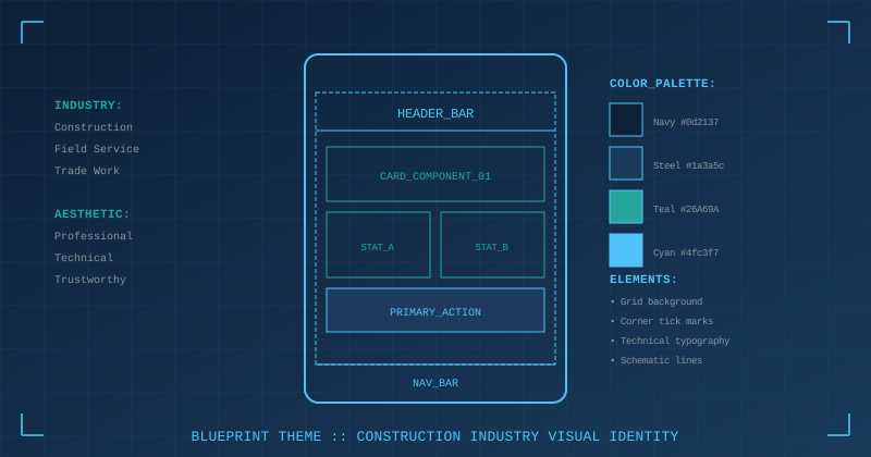
Generic business app aesthetics don't resonate with everyone. A crew of electricians doesn't connect with the same soft gradients and rounded corners that work for a meditation app. When we designed our crew management app for field crews, we needed a visual identity that said "this is a professional tool for professional work."
The answer was hiding in plain sight: blueprints.
Why Blueprints?
Construction workers spend their careers turning blueprints into reality. Architectural drawings, electrical schematics, plumbing layouts—these documents are the starting point of their work. The visual language is familiar:
- Grid patterns for precise measurement
- Navy/blue tones (traditional blueprint color)
- Technical precision in every line
- Corner marks indicating measurement points
When a field worker sees this aesthetic, it subconsciously communicates: "This app understands my world."
The Color Palette
Traditional blueprints use a specific blue from the cyanotype printing process. We adapted this for screens:
:root {
  /* Core blueprint colors */
  --m3-blueprint-navy: #1A365D;
  --m3-blueprint-navy-light: #2A4A7F;
  --m3-blueprint-teal: #40B4B4;
  --m3-blueprint-white: #E2E8F0;

  /* Grid lines - subtle but visible */
  --m3-blueprint-grid: rgba(64, 180, 180, 0.15);
  --m3-blueprint-tick: #40B4B4;
}
The navy (#1A365D) is our primary brand color. The teal (#40B4B4) provides accent and energy—it's derived from the app's logo.
The teal-on-navy combination has excellent contrast while staying within a cohesive color temperature. It feels technical without being cold.
The Grid Pattern
Blueprints have grid lines. We recreated this with layered CSS gradients:
.nav-scaffold {
  background-color: var(--m3-surface);
  background-image:
    linear-gradient(var(--m3-blueprint-grid) 2px, transparent 2px),
    linear-gradient(90deg, var(--m3-blueprint-grid) 2px, transparent 2px);
  background-size: 24px 24px;
}
This creates a subtle 24px grid that's visible enough to register but not so prominent that it interferes with content. The 2px line width works well on high-DPI mobile screens.
For headers, we use a fading grid that's stronger at the top:
.m3-page-header::before {
  content: "";
  position: absolute;
  inset: 0;
  background-image:
    linear-gradient(rgba(64, 180, 180, 0.12) 1px, transparent 1px),
    linear-gradient(90deg, rgba(64, 180, 180, 0.12) 1px, transparent 1px);
  background-size: 24px 24px;
  mask-image: linear-gradient(to bottom, rgba(0,0,0,0.6) 0%, transparent 70%);
  pointer-events: none;
}
The mask-image fades the grid from visible at the top to invisible at the bottom, creating depth without visual noise.
Corner Tick Marks
Architectural drawings have measurement marks at corners—small perpendicular lines indicating precise boundaries. We added these to cards:
.m3-card {
  position: relative;
  overflow: visible;
}

.m3-card::before,
.m3-card::after {
  content: "";
  position: absolute;
  width: 14px;
  height: 14px;
  pointer-events: none;
}

/* Top-left corner */
.m3-card::before {
  top: -3px;
  left: -3px;
  border-top: 2px solid var(--m3-blueprint-tick);
  border-left: 2px solid var(--m3-blueprint-tick);
}

/* Bottom-right corner */
.m3-card::after {
  bottom: -3px;
  right: -3px;
  border-bottom: 2px solid var(--m3-blueprint-tick);
  border-right: 2px solid var(--m3-blueprint-tick);
}
These small teal marks extend slightly outside the card boundary, mimicking the measurement indicators on technical drawings. It's a subtle detail that reinforces the blueprint aesthetic.
For active/selected cards, we add all four corners using DOM elements:
<div class="m3-work-order-card--in-progress">
  <div class="m3-card-node node-tl"></div>
  <div class="m3-card-node node-tr"></div>
  <div class="m3-card-node node-bl"></div>
  <div class="m3-card-node node-br"></div>
  <!-- card content -->
</div>
.m3-card-node {
  position: absolute;
  width: 8px;
  height: 8px;
  background: #FFFFFF;
  border: 2px solid #40B4B4;
  border-radius: 50%;
  z-index: 11;
}

.m3-card-node.node-tl { top: -8px; left: -8px; }
.m3-card-node.node-tr { top: -8px; right: -8px; }
.m3-card-node.node-bl { bottom: -8px; left: -8px; }
.m3-card-node.node-br { bottom: -8px; right: -8px; }
These circular nodes look like CAD selection handles—the points you'd drag to resize an object in drafting software. It's immediately recognizable to anyone who's worked with technical drawings.
The Header Gradient
Page headers use a navy gradient that reinforces the blueprint feel:
:root {
  --m3-gradient-header: linear-gradient(
    135deg,
    #1A365D 0%,    /* Navy */
    #2A4A7F 50%,   /* Navy-light */
    #1A365D 100%   /* Back to navy */
  );
}

.m3-page-header {
  background: var(--m3-gradient-header);
  border-bottom: 3px solid var(--m3-blueprint-teal);
}
The teal bottom border acts as a "drafting edge"—the line where the technical drawing meets the workspace.
Technical Typography
For numbers, timestamps, and codes, we use a monospace font:
:root {
  --m3-font-technical: 'Roboto Mono', ui-monospace, monospace;
}

.m3-technical {
  font-family: var(--m3-font-technical);
  letter-spacing: 0.5px;
}
Work order numbers, time displays, and reference IDs use this font. It reinforces the technical/precise nature of the data and improves readability of alphanumeric codes.
<span class="m3-technical">WO-2026-0142</span>
<span class="m3-technical">4h 32m</span>
When to Use (and Not Use) Blueprint Styling
The blueprint aesthetic should accent, not dominate. We use it for:
- Page headers — The navy gradient with grid overlay
- Card borders — Corner tick marks on work order cards
- Active states — Selection nodes on in-progress items
- The floating card background — Navy behind the app content
We don't use it for:
- Form inputs — Standard M3 styling for clarity
- Body text — Regular sans-serif for readability
- Buttons — M3 button styles (users expect standard interactions)
The goal is atmosphere, not theme park. Users should feel the blueprint influence without it getting in the way of actually using the app.
The Progress Bar Variant
We created a blueprint-style progress bar that looks like a measurement ruler:
.blueprint-progress {
  position: relative;
  height: 32px;
  background-color: var(--m3-blueprint-navy);
  border-radius: 4px;
  border: 1px solid rgba(255, 255, 255, 0.25);
}

/* Ruler marks */
.blueprint-progress__track {
  position: absolute;
  inset: 0;
  background-image: repeating-linear-gradient(
    90deg,
    rgba(255, 255, 255, 0.15) 0px,
    rgba(255, 255, 255, 0.15) 1px,
    transparent 1px,
    transparent 10px
  );
}

/* Progress fill */
.blueprint-progress__fill {
  position: absolute;
  top: 4px;
  bottom: 4px;
  left: 4px;
  border-radius: 2px;
  background: linear-gradient(90deg, #40B4B4 0%, #1A365D 100%);
}
The repeating gradient creates tick marks like a ruler. The fill uses the teal-to-navy gradient that matches our logo. It's distinctly "blueprint" while being immediately readable as a progress indicator.
Logo Integration
Our logo is a stylized "CT" monogram where the C (navy) wraps around the T (teal). The color palette for the blueprint theme is derived directly from the logo:
- Navy from the "C" →
#1A365D - Teal from the "T" →
#40B4B4 - The gradient direction → matches the logo's visual flow
This creates consistency between the brand mark and the app's visual language.
The Emotional Effect
Design choices have emotional weight. When a 55-year-old master electrician opens the app and sees navy backgrounds with grid patterns and corner marks, something registers:
"This was made for people like me."
That recognition builds trust. It says the developers understand the work, not just the software requirements. It's a small thing, but small things compound.
Key Takeaways
- Industry-specific aesthetics build trust — Generic doesn't resonate
- Familiar visual language — Blueprints are in every construction worker's mental vocabulary
- Subtle implementation — Accent, don't dominate
- Derive from brand — Our logo colors became our theme colors
- Technical typography — Monospace for codes and numbers
- Corner details matter — Tick marks and selection nodes add authenticity
- Know when to stop — Forms and buttons stay standard
The Test
Show the app to someone in the industry. If they say "this looks like it was made for construction," the theme is working. If they say "this is a nice shade of blue," you've made a color choice, not an identity.
Blueprint isn't just a color palette. It's a statement: we understand your work.
The best visual identities feel inevitable in retrospect. "Of course a construction app should look like a blueprint." But it took deliberate research into our users' world to see what was obvious all along.
Related Posts
- M3E for Blue-Collar Apps — The M3E principles behind these choices
- The Floating Card Pattern — How the navy background extends behind system chrome